Thursday, October 29, 2020
KVD Vegan Beauty Edge of Reality Eyeshadow Palette
eyeshadow
,
KVD Vegan Beauty
,
makeup
,
palette
,
review
,
swatch
,
swatches
1 comment
:
*Update*
Upon making a video about this palette and my first impressions on my YouTube channel, I became aware that this palette is fully recyclable, hence the "Flimsy" feel to it. The tray is indeed glued in, but is meant to be separated from the packaging when you finish it up and recycle it. I still stand by what I said in my review that I'm not crazy about the packaging, but whatever floats your boat! If it's better for the environment, I'm all in.

The KVD Vegan Beauty Edge of Reality Eyeshadow Palette is the latest from the brand. It's all white on the outside with gold trim and has a filigree design with a tiny skull. The first thing I noticed on removing this from the box is that it feels cheaply made. Not at all up to par with previous palettes. This is indeed the first one that doesn't have "Kat Von D" written anywhere on it, which leads me to believe that once all the components with her name stamped on them were used up, they went a cheaper route with the packaging. This is cardboard, but not the heavy duty stuff. It's flimsy and doesn't even have a magnetic closure. That really threw me off at first, because I'm used to a much better outer packaging from this brand.
BUT...
I am happy to say that the shadow quality hasn't been compromised. We will get to that in a minute!

The inside does not have a mirror. These usually ALWAYS have some sort of mirror. Again, they must have cut costs with the packaging. There is a little indentation for your finger to I assume pull out the tray of shadows, but it's glued in there so you can't really get it out even if you wanted to, unless you pry it and risk breaking some shadows. That seems unnecessarily dumb in my opinion.
The shadows are very flush with the packaging - it's hard to explain, but there is no actual tin that they are pressed into, they're just laid into the plastic tray.

Simulate is a matte chocolate brown.
Immersion is a matte peach.
Code is a matte terracotta.
Oculus is a warm metallic gold.
Green Screen is a metallic gold with green flip.
Dimensions is a metallic champagne.
Transformation is a metallic burgundy.

Illusion is a matte cream.
Levels is a matte taupe.
Escapist is a matte denim blue.
Abyss is a metallic black base with blue and green shimmers.
Teleport is a metallic rich purple.
4-D is a metallic light brown with green flip.
Critical is a metallic ruby red.
So, these colors are BEAUTIFUL. The formula is great and they swatch so nicely. The mattes don't feel quite as creamy and soft as they usually do, but they still perform great. I was VERY surprised because with the cheapy feeling packaging, I was sure the quality would go down on the shadows as well. Luckily that didn't happen. I hope this is just a one time thing they were trying out for this palette and that they'll use a different material for the next one because I REALLY don't like the packaging. But, the shadows are great and that's what really matters here.
Wednesday, October 21, 2020
ColourPop That's Taupe Palette

The ColourPop That's Taupe Palette is a gorgeous collection of cool toned shades that is absolutely perfect all my fellow taupe lovers.

This is one of their 9 pan palettes. It has 5 mattes and 4 metallics, one of which is a Super Shock formula.


Boa is a matte pale creamy taupe.
Pebble Beach is a matte pale chocolate taupe.
Python is a matte true taupe.

Slated (Super Shock Formula) is a metallic icy taupe with flecks of silver.
Snake Eyes is a metallic rosy taupe.
Cold Blooded is a metallic silver taupe.

Rock Steady is a matte deep taupe.
Constrictor is a metallic deep old gold.
Bedrock is a matte dark brown.
Saturday, October 10, 2020
ColourPop Hocus Pocus Collection!
ColourPop
,
cream liner
,
eyeliner
,
eyeshadow
,
glitter
,
makeup
,
palette
,
review
,
swatch
,
swatches
No comments
:

I was lucky enough to snag what I wanted from the Hocus Pocus collection when ColourPop released it (a day later than originally planned, but we won't talk about how I, like many other people, sat and waited trying to refresh their website for over an hour before they announced it wasn't working and they would push it back a day)!

First, I got the Gliterally Obsessed glitters. The packaging on these is so, so cute!! If you are unfamiliar with these, they are basically a gel loaded with glitter that you can use on your body (I do NOT recommend putting these anywhere near your eyes) or you can also use it in your hair!

The jars have Binx on the lid - I mean, how much cuter can they get?!

"Another Glorious Morning" is a peach holographic glitter and "Amok, Amok, Amok, Amok!" is a purply base with rainbow holographic glitter. There's so many different colors and sizes of glitter in each of these that it's hard to describe, but you can see how gorgeous they both are!

I'm not sure they're supposed to be scented, but they smell a bit like watermelon to me. I do have one other Gliterally Obsessed from a while back, and that one never smelled like anything, so I'm not sure if they changed their formula or what.

Next up is the Come, Little Children creme gel liner set.

The packaging, again, is super cute. It's got eyeballs all over the outside.

Trick or Treat is a deep metallic berry.

Black Flame Candle is a metallic olive.

Sistas! is a metallic brick red. This one is definitely my favorite and the most unique! The formula on these is awesome - it glides smooth and clean, and is super easy to apply. My absolute favorite formula for a twist-up liner like this!

Last but not least we have the Gather Round Sisters palette. This is such a great blend of fall colors, it's the perfect fall palette to me. I'm going to end up keeping the box it came in, because it looks like this:

Then the palette itself has this on the front:

And 15 beautiful colors on the inside:

I love the artwork on the inside as well - super fun caricatures of Mary, Winifred and Sarah.

But you all want to see swatches, right? Let's get to it!

Full moon is a pale cream yellow with silver micro sparkles.
Hello, Salem is a matte pale rosy taupe.
Brew Potion is a gold glitter with bronze base.
On Toast is a matte medium brown.
Coven is a matte warm brown with champagne, gold and silver sparkles.

Come Little Children is a light satin taupe with silver sparkle.
Tis' Firm is a metallic crimson.
Thackery Binx is a deep violet.
Yabbos is a metallic golden olive.
I Call It A Bus is a matte black base with orange, purple and green micro sparkles.

Wench is a icy silvery taupe.
Night of Frolic is a matte deep maroon.
Dead Man's Toe is a matte deep violet berry.
Bewitched is a matte olive green.
Goodbye Cruel World is a shimmery purply-toned brown.
I Call It A Bus is absolutely my favorite shade in here. If you could embody Halloween in an eyeshadow, this is it. Black with orange, green and purple sparkles? Heck yeah! Night of Frolic and Dead Man's Toe are gorgeous shades of berry - they swatch a little messy but they perform well on the eyes. I find Tis' Firm, Thackery Binx and Yabbos are a little more hard pressed in the pans than any of the others, but they are still awesomely pigmented. I love love love this palette especially because it came out at the perfect time of year!
Sunday, October 4, 2020
ColourPop Sandstone Palette

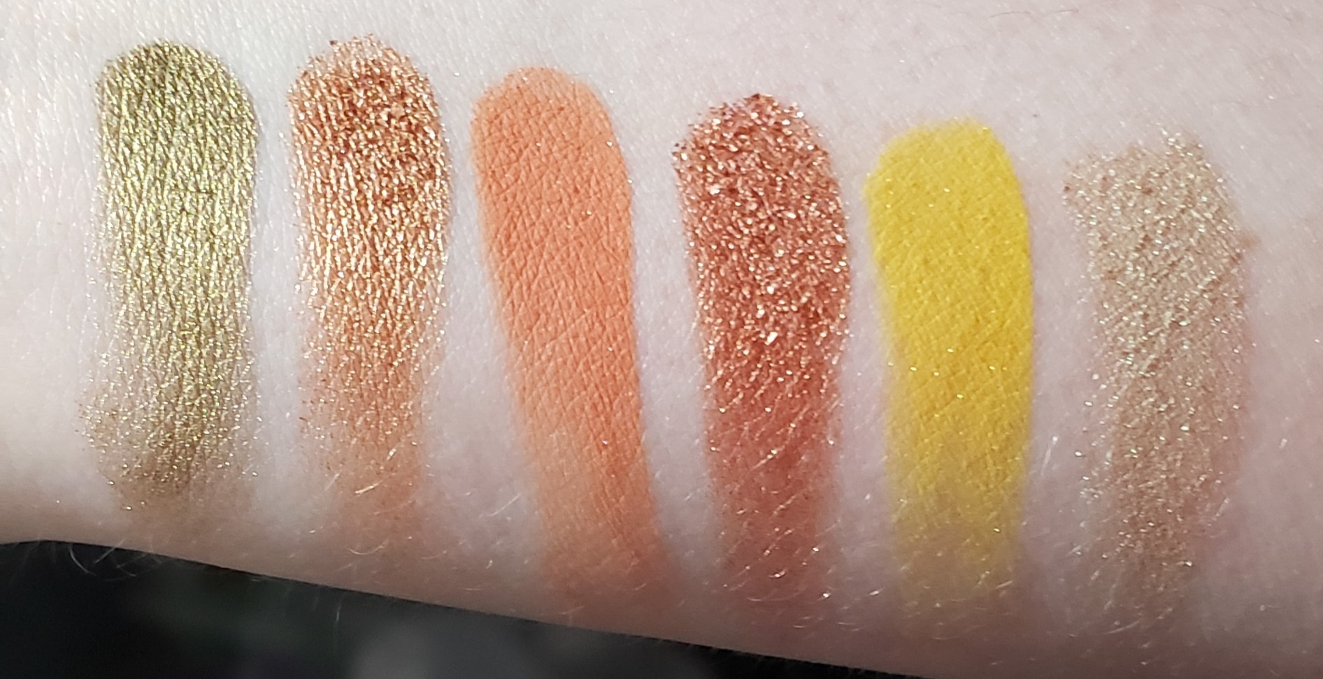
The Sandstone Palette from ColourPop is described as "warm and earthy." It definitely has some great fall colors in it. It is an 18 pan palette and retails for $22.

That pop of yellow is what screams to me in this palette. I love a good yellow! Especially when it's in a palette that has a lot of nice orange and brown tones. It just reminds me of fall leaves and is perfect for this time of year.


Big Bend is a matte pale cream yellow with gold micro sparkles.
Pueblo is a metallic sheer pale peachy-gold.
Open Rode is a matte peach with gold micro sparkles.
Vortex is a matte warm taupey beige.
Quest Crew is a matte golden brown.
Bell Rock is a metallic pinky beige.
Westward is a metallic golden olive.
Red Earth is a metallic bronze with a gold flash.
Canyon Loop is an orangey terracotta with pink and gold micro sparkles.
Spring Valley is a metallic copper.
Oasis is a matte bright yellow with gold micro sparkles.
Desert Sky is a metallic pale lime with a strong golden shift.

Blaze is a matte blackened brown.
Recharge is a matte chestnut with gold and copper micro sparkles.
Wild Creek is a metallic deep brownish plum.
Big Butte is a matte rusty orange.
Grounded is a matte deep cinnamon.
Templeton is a matte deep mahogany.
The colors in this palette, especially the mattes, are rich with pigmentation. I will note that this is listed as a "pressed powder palette" and not an eyeshadow palette, although there are no notations on the packaging or the website that say any of the shadows are "not intended for use in the immediate eye area." So I'm not sure why they didn't just call this an eyeshadow palette? I was just curious and couldn't find the info anywhere, so I just figured I would point it out. I expect to get a lot of use out of this baby in the coming months!!
Saturday, October 3, 2020
ColourPop Coast to Coral Palette

The Coast to Coral Palette from ColourPop is like a darker version of their Baby Got Peach palette. They compliment each other quite nicely! This one, however, has a nice hot coral that you don't see too often. Let's check it out!


There are 3 metallic shades, 4 mattes, and 2 matte-based shades that have micro sparkles in them.

Atoll is a golden peach with gold shift.
Crush is a matte pale pink.
The Keys is a metallic reddish coral with gold shift.

Anemone is a matte bright hot coral.
Diver is a red-orange coral with gold shift.
Keep Swimming is a matte peachy coral with silver and gold micro sparkles.

Queensland is a matte burnt orange.
Angelfish is a matte deep coral.
Drop Off is a warm matte brown with gold and pink microsparkles.
An overall solid palette, as usual! Not a color story I would think of for fall, but it works. The bottom row can definitely be incorporated into fall looks, and I love that bright coral! Another fun palette from ColourPop with no dud colors. The only thing I will say is if you're pale like me, Crush basically doesn't show up at all lol.
Subscribe to:
Posts
(
Atom
)