
Wednesday, February 17, 2016
Dose of Colors Hidden Treasure Eyeshadow Palette
Dose of Colors
,
eyeshadow
,
makeup
,
palette
,
review
,
swatch
,
swatches
No comments
:

Dose of Colors recently launched their FIRST eyeshadow palette called the Hidden Treasure Palette. Like many, I was turned off by the layout of it. It's horrid, I will say that right off the bat. If you can get past that, the quality of the shadows is absolutely awesome and definitely worth a look!
At $50, I would say that's pushing it for an indie brand's first palette release, but then you've got to remember that Melt Cosmetics launched $48 4-pan shadow stacks that everyone went bonkers over, so I think it's all just whether or not you're wanting it enough to grab one.

The palette is thin and sleek, made of heavy duty cardboard, and is magnetic. The shape and size reminds me a lot of the Zoeva palettes. The mirror in the lid is decent, but the shadow layout - To be honest, it looks like someone had too much to drink and decided to design a shadow palette. I just don't get it. There's no rhyme or reason to it, everything looks discombobulated. Not to mention that lower right hand corner is completely bare. At the very least they could have added one more shade there to make it look somewhat better.

I get that maybe they were going for "treasure" just thrown into a treasure chest, but even that is pushing it. Why not line them up symmetrically? Why not shape the shadows like diamonds or gems and line them up straight? It had so much potential to look better, and I think they dropped the ball with the design.
Once I tried the shadows, however, I was instantly impressed. Let me get into the swatches so you can see what I mean.

Pearl is the only shimmery shade in the palette. It's a light champagne, perfect for all over the lid or as a highlight.


Crown is a metallic copper. Very bold and bright, the metallic shades in this palette are out of this world!

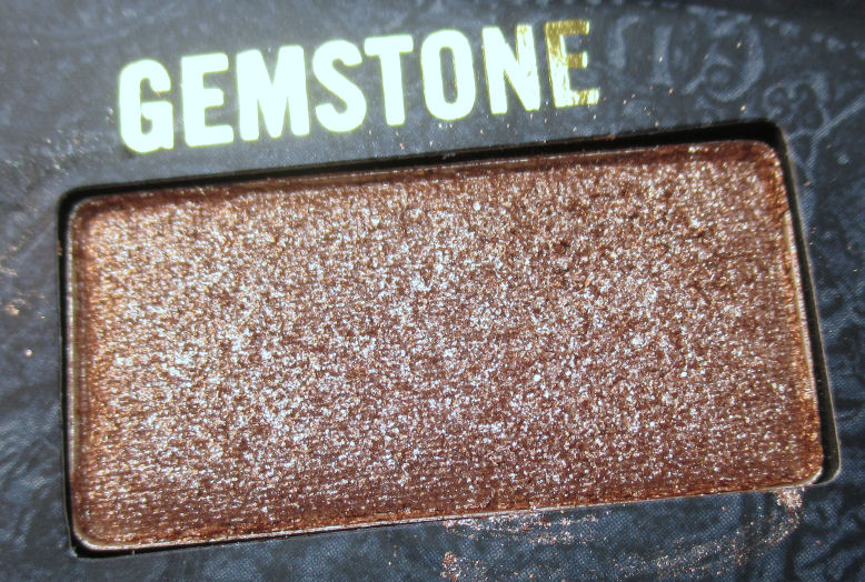
Gemstone is a metallic taupe. This makes another awesome all-over lid color.


Locket is a matte orangey beige. The matte shades in the palette remind me a lot of the Lunatick Cosmetic Labs ones. They are dry in texture yet blend amazingly well.


Diamond is a metallic rose gold. Gorgeous shade!


Coin is a metallic true gold.


Key is a matte chocolate brown.


Ruby is a metallic rusty red shade. This is probably my favorite in the palette!


Map is a matte light taupe. This is the perfect crease/transition color, and I'm glad it was included in the palette.


Onyx is a matte black. It is VERY black and pigmented, yet blends super nicely!

As a quick rundown, the one shimmery shade, Pearl, is a nice light shade perfect for that inner corner highlight. The mattes are all great and remind me a lot of the Lunatick ones in that they feel dry, yet blend effortlessly. The metallics are the standout shadows here, as they are insanely pigmented and smooth. You don't have to "dig" in them to get product up - if you do that, you'll make a mess with them. Some of the shades are chunky but for some reason not overly-messy or fallout-y when I use them on my eyes.
So, you take the good with the bad with this palette. Awesome product, not so great packaging. I was definitely happy that the shadows were awesome. Every one of them is great and if it wasn't for the horrible layout, this palette would be a perfect 10 for me!
Subscribe to:
Post Comments
(
Atom
)


No comments :
Post a Comment